
Itacolomi is a result from Eller’s Ph.D. research into the introduction of the printing press in Brazil. The types used in the Abelha do Itaculumy newspaper printed by Tipografia Patrícia de Barbosa (figure 01) were precisely the basis for this project.
The investigation reveals that around 1820, faced with the lack of resources and censorship, typical of the colonization period, the engraver Padre Viegas de Menezes (1778–1841) and the artisan Manuel José Barbosa (17? –18? ) found motivations for the construction of a complete printing workshop. Following only models found in books and with local resources, they manufactured all the machinery and cast a set of metal types, later used in the first newspapers of the then province of Minas Gerais. The main inspirations for these types were somehow the Scotch Roman models.
Like those Brazilian historical types, the Itacolomi typeface was also intrinsically influenced by the models known as Scotch Romans, created in Scotland by Richard Austin and disseminated, mainly by William Miller and Alexander Wilson, between the 18th and 19th centuries.

Somehow, this research represents the reconstruction of history with many gaps, so more room was allowed for imagination, expanding the concept of interpretation in order to recreate unique characteristics of the types cast in Minas Gerais. As a result, this project features a contemporary digital font with cultural traits and roots, revealing the diverse historical narrative of the typography development process in Brazil.

Itacolomi is a personal interpretation, rather than a type revival.
It is a convergence of Scottish references with the visual solutions found in the types of Tipografia Patrícia de Barbosa seen in the newspaper Abelha do Itaculumy.
In short, Itacolomi preserves the qualities of the famous 19th-century Scotch Roman types while adding a personal approach with unique features from the Brazilian models.
It has six weights, romans plus respective italics, which makes twelve fonts with an extensive character set that supports over two hundred languages and includes small caps, ligatures, old-style and tabular figures.
Please check the specimen (pdf) for text examples, character set, language support and OpenType features

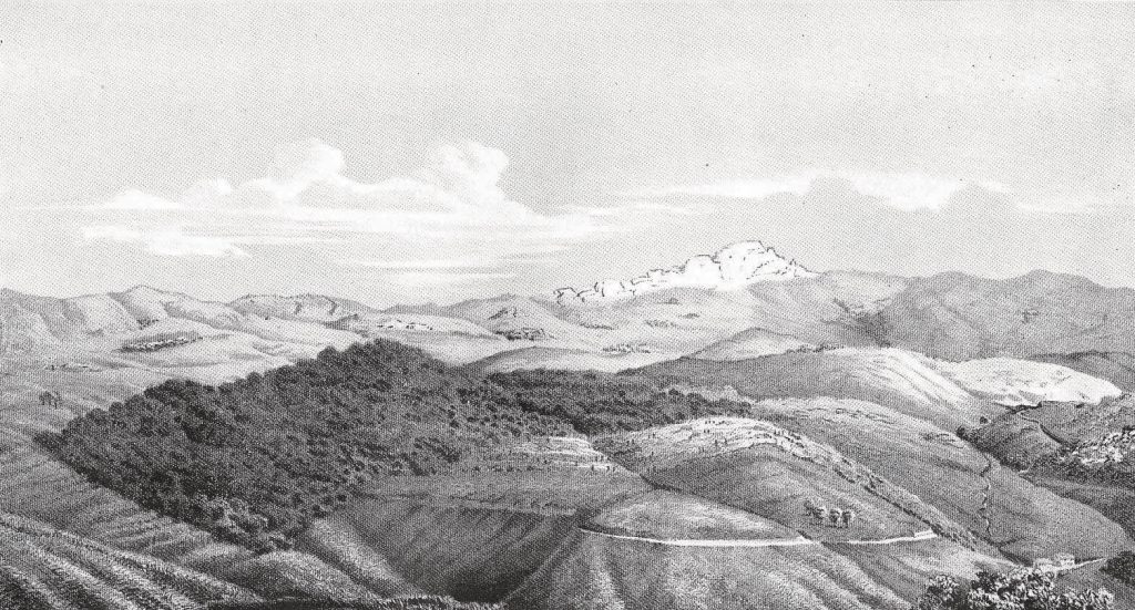
Itacolomi (or Itaculumy) is a Brazilian indigenous word that means «stone girl» and refers to a specific hill in the state of Minas Gerais.